


Re: 2019 Kits : Fri Nov 30, 2018 8:46 pm
ThePrinter wrote:
Looks a bit plain and boring. Nice that the sponsors logo changes colour but again I dislike changing the club badge on away kits to suit the shirt. Your badge represents your club and for me shouldn’t be altered colour wise regardless of what the shirt looks like.
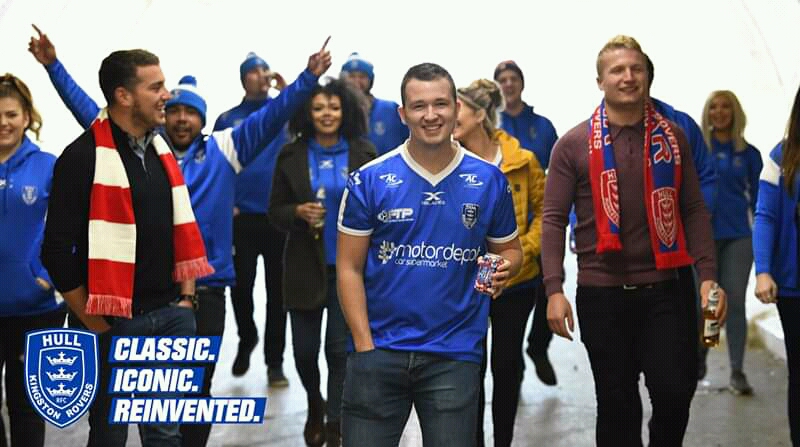
Got to say at well, the state of some of their promotional shots. A bunch of fans walking down a tunnel with half empty bottles of Carling in their hands looking like rejects from some football hooligan film starring Danny Dyer. Really the best they could do?
Got to say at well, the state of some of their promotional shots. A bunch of fans walking down a tunnel with half empty bottles of Carling in their hands looking like rejects from some football hooligan film starring Danny Dyer. Really the best they could do?
Agree entirely on the club badge.
I know what you mean on the video, it’s a bit cringey at times but I suppose in their defence they’re at least trying something rather than just sticking a photo up on the website.
What annoyed me most was the terrible writing of the article on the website. It looks like it’s written by middle set GCSE students. That’s not a critcism that’s unique to Hull KR though, I’m constantly amazed at how god awful some of the content is on many clubs websites.