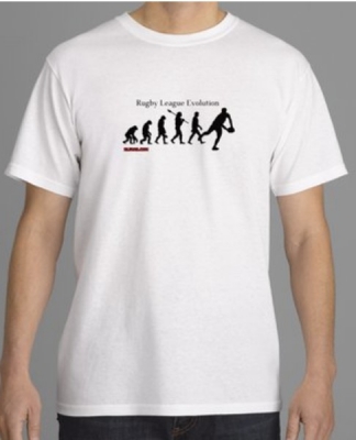
Having bought the last shirt Rally did, i can say it is an excellent design and made from good quality material. Alot of saints fans asking where it was sold, I shall be purchasing the Meninga shirt from Rally. Well worth the cash
I'm gonna offer some (hopefully) constructive criticism and hope I don't come across as a bitchy/whinging c***...
I love the idea behind this, however, compared to the shirt you did last year I think this scores low. The original (as seen here for those who don't remember it) looks so good because of its simplicity. This new imagining of the design is a bit 'busy' and your badges and the sponsor text are very much out of proportion (i.e. too big).
Personally I would make it a bit 'cleaner' and more retro looking by a) losing the white bits from the shoulders etc, b) making the St.Helens Class logo smaller and more compact, c) making the two website logos much smaller and putting them on the bottom of the sleeves and d) putting the town crest on the neck and ditching the supporters crest you created (which I can't find it in me to like, sorry).
But then it's your design and project to do with as you will and clearly people like it so I'll shut up now.
As a shirt design fanatic, my own critique for what its worth is that I like this a lot because it really stands out from other similar kits that have been marketed in this design. If you drop the logos then what makes this unique from the other re-issues of this shirt down the years? You're bound to attract curiosity wearing this.
My only criticism is the crest. It should always be the centrepiece of a kit. It looks messy and lacks symmetry. The text needs tightening up basically. I think it would look good if both the text curved around the stickman, and make it symmetrical. But whatever, that needs cleaning up and then the kit is the finished article. Great job rally.
CHALLENGE CUP WINNERS 2006,'07 & '08
Giant killers, Dragon slayers & Airlie Birds wing clippers
75-0 thats a record score... 16 yrs of misery, gone in 80 minutes
If God took up rugby league then his name would have been Vollenhoven with AJ Murphy along too
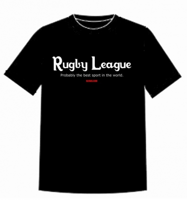
Dont know if its me or your link, but clicking on "here" got me no-where, sorry would have liked to have seen last years
Tony Stark wrote:
I love the idea behind this, however, compared to the shirt you did last year I think this scores low. The original (as seen here for those who don't remember it) looks so good because of its simplicity.
I'm gonna offer some (hopefully) constructive criticism and hope I don't come across as a bitchy/whinging c***...
I love the idea behind this, however, compared to the shirt you did last year I think this scores low. The original (as seen here for those who don't remember it) looks so good because of its simplicity. This new imagining of the design is a bit 'busy' and your badges and the sponsor text are very much out of proportion (i.e. too big).
Personally I would make it a bit 'cleaner' and more retro looking by a) losing the white bits from the shoulders etc, b) making the St.Helens Class logo smaller and more compact, c) making the two website logos much smaller and putting them on the bottom of the sleeves and d) putting the town crest on the neck and ditching the supporters crest you created (which I can't find it in me to like, sorry).
But then it's your design and project to do with as you will and clearly people like it so I'll shut up now.
I don't mind people letting me know what they do and don't like.
A)I understand what you mean about the white stripes but I was after adding a little bit of modern twist to the shirt.
B)The size of the images on the sleeve do look over sized but they would look smaller when the suppliers done their techincal drawing of the shirt.
C)Again the website logos won't big so big on the final drawing but I did consider putting them on the back.
D) Not everyone likes the same things and if we did we'd all be boring. I haven't taken any offence to you not liking the supporters badge.
Sadfish wrote:
I would drop all the logos personally and just leave the basics.
But as Tony said, it's your project, not sure how you get on with stickman copyright though....
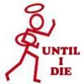
The stickman is different if you look closely
Crackador wrote:
As a shirt design fanatic, my own critique for what its worth is that I like this a lot because it really stands out from other similar kits that have been marketed in this design. If you drop the logos then what makes this unique from the other re-issues of this shirt down the years? You're bound to attract curiosity wearing this.
My only criticism is the crest. It should always be the centrepiece of a kit. It looks messy and lacks symmetry. The text needs tightening up basically. I think it would look good if both the text curved around the stickman, and make it symmetrical. But whatever, that needs cleaning up and then the kit is the finished article. Great job rally.
Yeah I get what you mean. The reason why im using the stickman is because that was on the shirt at the time. I was thinking of having 'St. Helens Rugby League Supporters' curve around the stickman, but for some reason I haven't been about to do this on photoshop! I wanted to include the town crest in the shirt because rugby league teams seem to have lost touch when in comes to heritage. I have moved the logo to the back below the collar. Any better?
Is this one any better?
Tony Stark wrote:
I'm gonna offer some (hopefully) constructive criticism and hope I don't come across as a bitchy/whinging c***...
I love the idea behind this, however, compared to the shirt you did last year I think this scores low. The original (as seen here for those who don't remember it) looks so good because of its simplicity. This new imagining of the design is a bit 'busy' and your badges and the sponsor text are very much out of proportion (i.e. too big).
Personally I would make it a bit 'cleaner' and more retro looking by a) losing the white bits from the shoulders etc, b) making the St.Helens Class logo smaller and more compact, c) making the two website logos much smaller and putting them on the bottom of the sleeves and d) putting the town crest on the neck and ditching the supporters crest you created (which I can't find it in me to like, sorry).
But then it's your design and project to do with as you will and clearly people like it so I'll shut up now.
I don't mind people letting me know what they do and don't like.
A)I understand what you mean about the white stripes but I was after adding a little bit of modern twist to the shirt.
B)The size of the images on the sleeve do look over sized but they would look smaller when the suppliers done their techincal drawing of the shirt.
C)Again the website logos won't big so big on the final drawing but I did consider putting them on the back.
D) Not everyone likes the same things and if we did we'd all be boring. I haven't taken any offence to you not liking the supporters badge.
Sadfish wrote:
I would drop all the logos personally and just leave the basics.
But as Tony said, it's your project, not sure how you get on with stickman copyright though....
The stickman is different if you look closely
Crackador wrote:
As a shirt design fanatic, my own critique for what its worth is that I like this a lot because it really stands out from other similar kits that have been marketed in this design. If you drop the logos then what makes this unique from the other re-issues of this shirt down the years? You're bound to attract curiosity wearing this.
My only criticism is the crest. It should always be the centrepiece of a kit. It looks messy and lacks symmetry. The text needs tightening up basically. I think it would look good if both the text curved around the stickman, and make it symmetrical. But whatever, that needs cleaning up and then the kit is the finished article. Great job rally.
Yeah I get what you mean. The reason why im using the stickman is because that was on the shirt at the time. I was thinking of having 'St. Helens Rugby League Supporters' curve around the stickman, but for some reason I haven't been about to do this on photoshop! I wanted to include the town crest in the shirt because rugby league teams seem to have lost touch when in comes to heritage. I have moved the logo to the back below the collar. Any better?
Is this one any better?
This post contains an image, if you are the copyright owner and would like this image removed then please contact support@rlfans.com
Who is online
Users browsing this forum: No registered users and 25 guests
REPLY
Please note using apple style emoji's can result in posting failures.
Use the FULL EDITOR to better format content or upload images, be notified of replies etc...


 I wanted to include the town crest in the shirt because rugby league teams seem to have lost touch when in comes to heritage. I have moved the logo to the back below the collar. Any better?